@listless to Data is Beautiful@lemmy.worldEnglish • 2 years agoCity Street Orientation Visualizationlemmy.cringecollective.ioimagemessage-square41arrow-up1242arrow-down124file-text
arrow-up1218arrow-down1imageCity Street Orientation Visualizationlemmy.cringecollective.io@listless to Data is Beautiful@lemmy.worldEnglish • 2 years agomessage-square41file-text
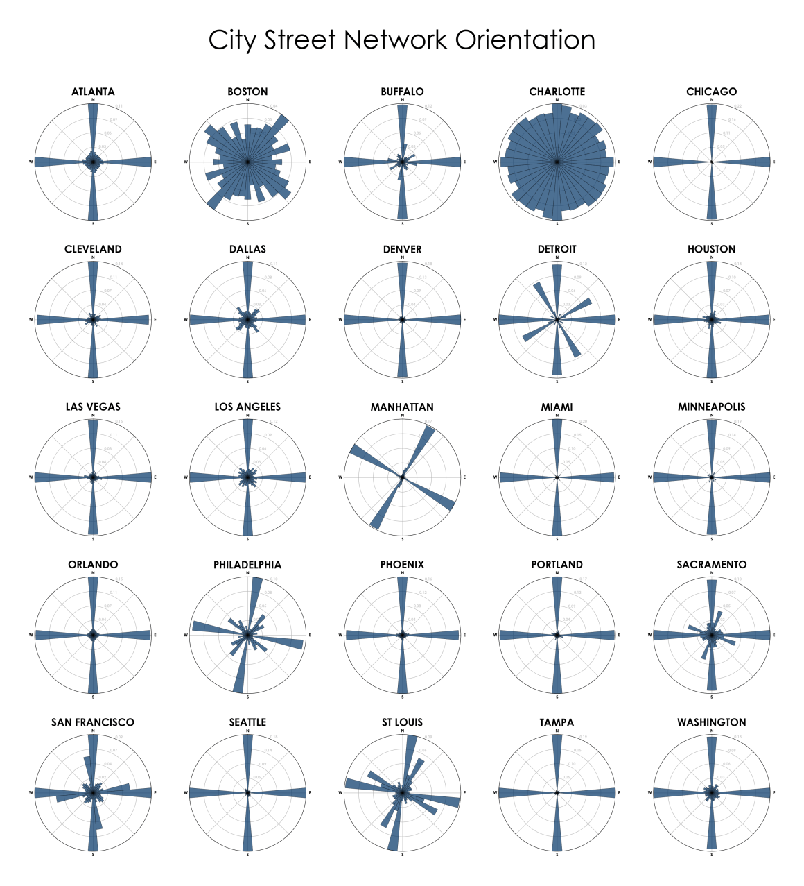
minus-square@kriz@slrpnk.netlinkfedilinkEnglish7•2 years agoCharlotte might be earth’s most confusing city.
minus-square@trxxruraxvr@lemmy.worldlinkfedilinkEnglish21•2 years agoMost places in Europe would have a graph similar to Charlotte. Only new cities in the colonies were build to a rectangular grid.
minus-square@DampCanary@lemmy.worldlinkfedilinkEnglish10•2 years agoby this charlotte looks more similar to naturally grown old world citys.
minus-square@Mango@lemmy.worldlinkfedilinkEnglish2•edit-22 years agoYo, why is this down in the comments and not the actual post?? Edit: just looked at Charlotte on the map. Geez that’s fucked.

Charlotte might be earth’s most confusing city.
Most places in Europe would have a graph similar to Charlotte. Only new cities in the colonies were build to a rectangular grid.
by this charlotte looks more similar to naturally grown old world citys.
Yo, why is this down in the comments and not the actual post??
Edit: just looked at Charlotte on the map. Geez that’s fucked.